
Releese started from conversations around addiction and mental health.
I always had a deep curiosity for how people work beneath the surface, so with my own experience of being witnessed and relatively unexplored topic in the design world, I dove in to emotional health from a UX designers lens.
Framing context
Understanding context
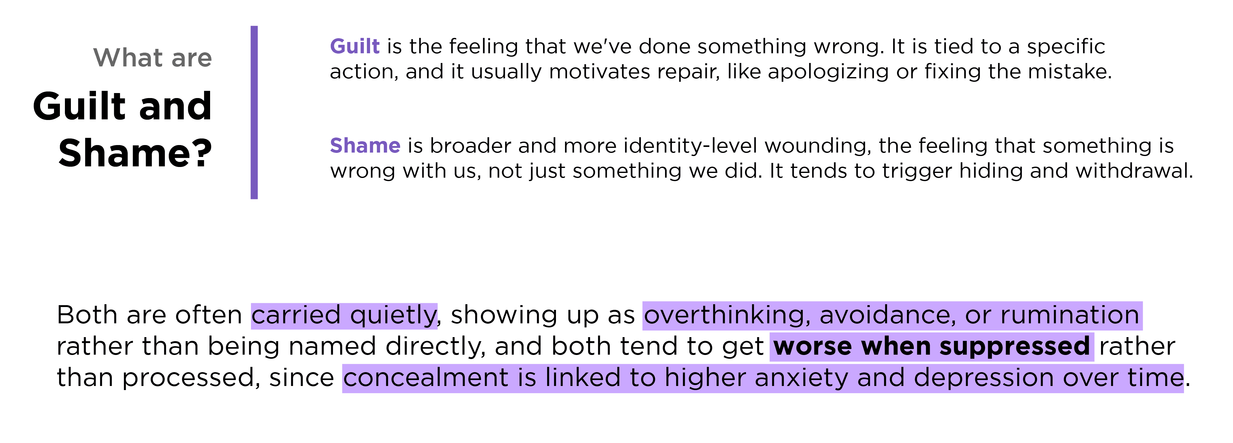
At its core, this is about release without exposure overload. We all struggle with heavy thoughts, the parts of us we don't want to acknowledge are there. We want them out of our head, but we don't want to involve someone we know, or risk further judgement.
Anonymity makes honesty easier, but it opens up its own trust problems:
who's reading this, what happens to my words, will this space actually feel safe or just chaotic? And underneath all of it, the product can never slide into therapy-mode. It has to stay clearly about witnessing, not intervention.

What the research showed
Interviews, surveys, and the jobs-to-be-done work all pointed the same direction: people want to feel heard, stay anonymous, avoid judgement, avoid advice, and keep the effort low. Journaling helps, but a lot of people said it still doesn't fully scratch the itch, because the piece that's missing is acknowledgement. The gains and pains mapping made this obvious. On one side: no judgement, feeling heard, closure, distance from the thought. On the other: embarrassment, fear of judgement, and just not knowing how to explain it to someone.

What the interviews revealed
Two interview participants zeroed in on the marketplace challenge: a product like this needs enough witnesses and sharers showing up at the same time, otherwise the early people take an emotional risk by sharing and get nothing back. Their suggestion was to seed the space through real-world communities, support groups and cohorts, and to use AI carefully to soften the cold start without replacing what actually makes being witnessed meaningful.
The psychologists I spoke with focused on the guardrails: confidentiality, consent, staying well clear of anything that looks like clinical intervention, and building redirects that never shame someone for sharing something heavy. They also confirmed the core idea from another angle: witnessing tends to land better than solutions, and it's both the safer choice and the one that actually matches what people need in those moments.


The Brief
The response needed to lower the fear of judgement and the "how do I even say this" friction, protect people's identity, and resist becoming an engagement loop. Safety had to be designed in from the start: clear expectations, real moderation boundaries, and guardrails that keep the tone calm and non-directive.

The insights that shaped Releese
People aren't looking for solutions, they're looking to be witnessed, not fixed.
Early exploration focused on how much moderation to put on users witnessing a releese, the outcome of which would influence the personal feel of the interaction. Too much control and the responses carry no weight, too little and it risked becoming reddit.
The solution had to give the feeling a real human knows this about them (anonymous or not) and has to be non judgemental. Safeguards were designed so the releeser can choose between pre-written and approved witness responses, or accept custom (but moderated) ones from their witnesser. Enabling choice was a big part of the design decisions for users to feel safe.
Second, the original proposed 7-day fade had good intentions, but ignored the reality of messy emotional processing. A real turning point came out of a conversation with Ryan Hubbard and Joe Sciglitano, which is what pushed the direction away from a rigid seven-day fade and toward something the user controls themselves, backed by five releese slots and check-ins that weight attachment as witnesses start coming in. Noticing what felt "too social" or "too therapy-like" along the way helped sharpen the tone into something gentle and symbolic, designed to be acknowledged rather than solved.
A "processed when you're ready" approach was chosen to match how emotional weight really shifts over time. Check-ins and weighting attachment started to matter more than something as blunt as "You need to share and let this go in 7 days."

How the concept evolved

The app moved a long way from where it started. The early version was closer to an anonymous confession board; what it became was something far more intentional, anonymous witnessing at the core, structured responses instead of comments, emotional mirroring instead of likes and a sky map to hold it all.
Core design challenges:
Creating safety through anonymity, while still making the experience impactful through vulnerability and connection
Keeping every interaction "witnessing, not fixing", supportive without tipping into advice or performing positivity.
Enough guardrails to block harm (PII, judgment, harassment) without making users feel policed or exposed.
Tone, type, pacing, and motion need to feel calm and ritual-like, but still fast and legible.


What testing surfaced
Testing mostly showed me the moments where the vibe broke: mobile Safari quirks, confusing waits, overlays stacking on top of each other, timing that felt right in one place and off in another. The fixes weren't purely technical, they were product decisions. Queue prompts so nothing competes for attention. Show human status text like "checking for kindness…" or "sending your witness…" instead of leaving people in silent delay. Tighten moderation so it actually explains what wasn't helpful witnessing and how to rewrite it.


Final reflections
I'm opening this up for anyone to test, because further development seems unlikely from here unless something changes. I'm proud of what came out of this process (the background algorithm is truly impressive to me), and honestly still working out whether another app is the right answer to the problem I was trying to solve.
I don't think a screen ever will be. But the problem itself feels real, and maybe this could be further developed to integrate and expand beyond just the screen, helping people and shame be seen.
Test the app at: releese-app-test.vercel.app